📱 Mobile & Tablet Friendly Web Design Services
“Seamless Web Experiences on Every Screen.”
Designs that adapt. Performance that impresses. Make your website look amazing on mobile, tablet, and desktop.
✅ Fast loading
✅ Touch-optimized layouts
✅ Built for conversion on any device
👉 Let’s build a responsive site that works everywhere.
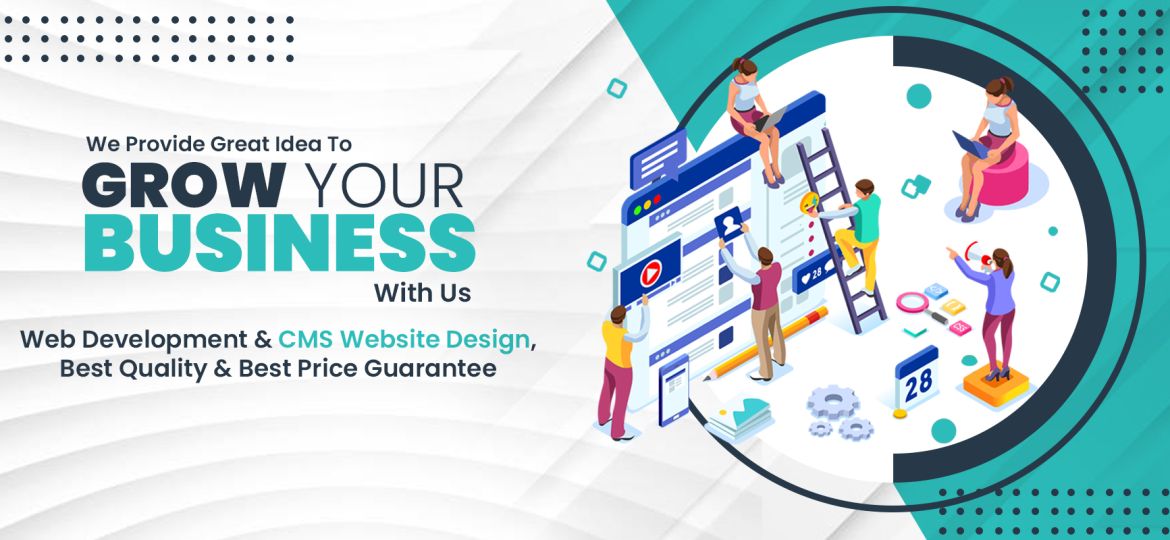
🧩 Service Description
Why Mobile-First Matters
Over 60% of web traffic comes from mobile devices. If your site isn’t mobile-friendly, you’re leaving money—and visitors—on the table. I create fully responsive WordPress websites that adjust to all screen sizes without sacrificing design, speed, or usability.
Whether you’re starting from scratch or need to upgrade your existing site, I ensure your web presence is built with a mobile-first approach, delivering a consistent experience across smartphones, tablets, and desktops.
🛠️ What’s Included (Key Features)
✅ Responsive Design
Pixel-perfect layouts that adapt fluidly to any screen size.✅ Mobile-First Development
Prioritized performance and usability for mobile users.✅ Touch-Friendly UI/UX
Easy-to-tap buttons, swipeable sliders, and thumb-friendly navigation.✅ Speed Optimization
Minimized loading times for better mobile performance and SEO.✅ Cross-Browser Compatibility
Tested on major browsers and devices to ensure consistency.✅ SEO-Ready Structure
Clean, mobile-optimized code structure for better rankings.✅ Custom Breakpoints (if needed)
Tailored designs for unique tablet sizes or screen resolutions.
📷 Visual Section / Example Work
Before & After screenshots of a mobile redesign.
Device mockups (phone, tablet, laptop) showing responsive previews.
Optional video/gif of scrolling interaction.
q508h0
1lmrxz
l9zz3b
I truly appreciate this post. I’ve been looking all over for this! Thank goodness I found it on Bing. You’ve made my day! Thank you again!
g4ire3
q1dkrd
I like this web blog so much, saved to my bookmarks.
Great blog you have here but I was wanting to know if you knew of any user discussion forums that cover the same topics talked about in this article? I’d really love to be a part of community where I can get opinions from other experienced individuals that share the same interest. If you have any recommendations, please let me know. Kudos!
I got what you intend, regards for posting.Woh I am happy to find this website through google.
aou9sc
l69d8y
i5ggk9
kftgqm
Este site é realmente demais. Sempre que consigo acessar eu encontro coisas incríveis Você também pode acessar o nosso site e saber mais detalhes! Conteúdo exclusivo. Venha saber mais agora! 🙂
Your article helped me a lot, is there any more related content? Thanks!
Thanks for sharing. I read many of your blog posts, cool, your blog is very good.
Can you be more specific about the content of your article? After reading it, I still have some doubts. Hope you can help me. https://accounts.binance.com/en-NG/register-person?ref=YY80CKRN